Choosing a great color scheme is always a pain for the designers. The web pages should look pleasing and beautiful but not like a color palette. Since color combination is responsible for user interactivity and building trust among users, a designer must be very careful while deciding the right mix of colors. Though it might sound tough, here, I reveal 7 proven techniques to create effective color schemes for web pages easily along with some highly useful free online tools that'l help you further.
Before that, you need to know in details about the color scheme and the color categories that fall into it.
What is a color scheme?
Color scheme is the combination of colors which are used in a design. The colors used in a color scheme can be categorized as follows.
- Primary Color
- Secondary Color
- Accent Color
- Neutral Color
- Semantic Color
Primary Color
Primary color is the base color of any design which is the most used color in the mix. It is generally taken from the logo of the company. If the logo contains multiple colors, you can use one of them as the primary color while using others as secondary colors.
Secondary Color
Secondary color is another base color is the design which is optional but used most of the times. It's used a bit lesser than the primary color but more than the others and it helps to make some sections of the page distinguishable to others.
Accent Color
Accent color is the color mostly used to style UI elements like forms and buttons as well as to highlight some contents. Secondary colors can also be used as accent colors. Generally, accent colors are brighter and eye catching which makes the UI elements highly noticeable and encourage user interactions.
Neutral Color
The shades of black and white colors are called the neutral colors which are generally used as background color or text color. They add up consistency in the design while creating a feel of open space within the page which won't have been available if the primary or secondary colors were used.
Semantic Color
Semantic colors are the colors used to display information related to some action or event performed by the user in the page. They are the meaningful colors which describe if the action was successful or not. These colors are used to display success message, errors, warnings or some informations.
Now, you have the basic understanding about the color scheme and the group of colors in it, lets have a quick look on the traditional color scheme patterns and some tools to generate them.
Color Scheme Patterns
Some colors get along with others seamlessly while others create a stark contrasting effects which can be tiresome for users' eyes. There are a few traditional color scheme patterns which can help you out to find the right mix of colors which are as follows.
1. Monochromatic Color Scheme
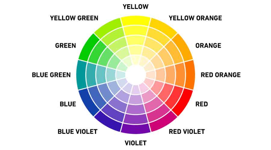
Monochromatic Color Scheme is the combination of colors which are created from the single base hue but with different tones and tints. Tints are achieved by adding white and shades and tones are achieved by adding a darker color, grey or black. It allows a greater range of contrasting tones that can be used to attract attention, create focus and support legibility. Here's an example of monochromatic color scheme.
2. Shades Color Scheme
Shades Color Scheme is a variant of Monochromatic color scheme which takes up 4 different shades of the base color in comparision to the monochromatic one. Here's an example of shades color scheme.

3. Analogous/Adjacent Color Scheme
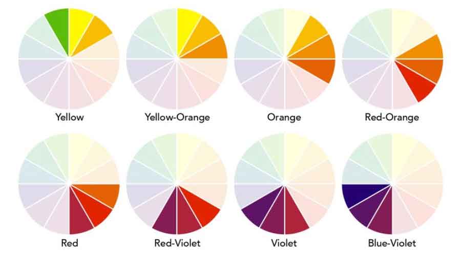
Analogous/Adjacent Color Scheme is the combination of adjacent colors in the color wheel which match well and create a hamony. Here's an example of analogous color scheme.
4. Triad Color Scheme
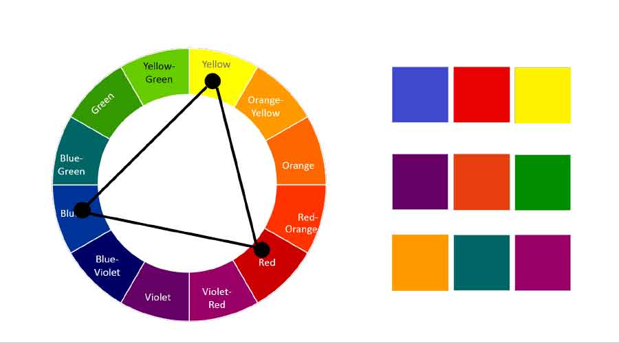
Triad Color Scheme is the combination of three colors that are evenly spaced in the color wheel. Triadic color scheme is quite vibrant, even if pale or unsaturated versions of the hues are used. The third color is generally used as an accent. Here's an example of triad color scheme.
5. Tetrad Color Scheme
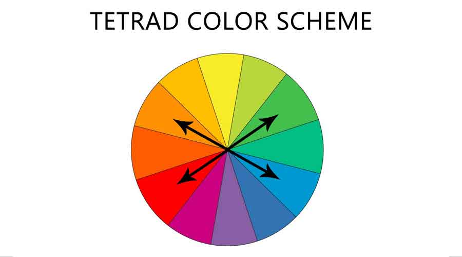
Tetrad Color Scheme is the combination of 4 colors from the color wheel which are evenly spaced. In a tetrad color scheme, all 4 colors should be used evenly as there won't be any dominant color. Here's an example of tetrad color scheme.
6. Complementary Color Scheme
Complementary Color Scheme is the comniation of 2 opposite colors in the color wheel that provides high contrast and a vibrant look to the design if managed effeciently. Here's an example of complementary color scheme.
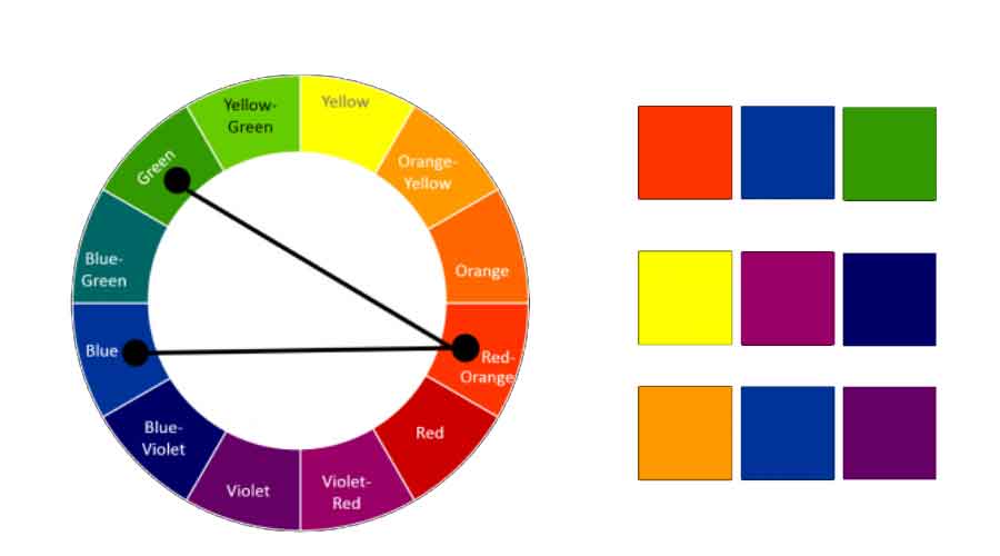
7. Compound Color Scheme
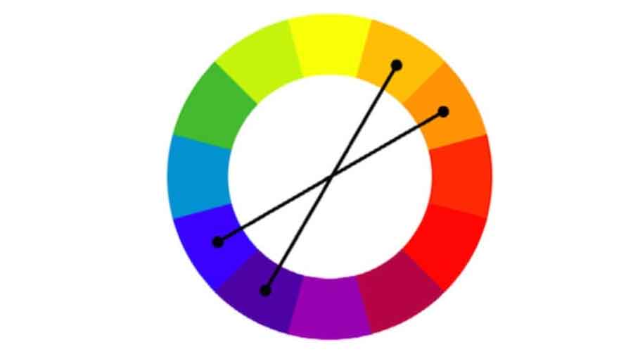
Compound Color Scheme is the variation of complementary color scheme where adjacent colors of the complementary colors are also taken making the total number of colors 4. Here's an example of compound color scheme.
Color Scheme Tools
You can find a lot of color scheme tools online where some are free and the others are premium. All of them aim to make your job easier to pick up a color scheme for your web page. Here is a list of 3 best color scheme tools which are absolutely free and give you the best options as well.
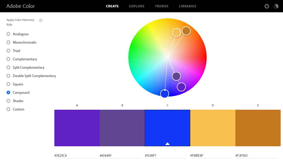
1. Color Wheel | Color Schemes - Adobe Color CC
Adobe Color CC allows you to use a color wheel to create a color scheme and provides an excellent collection of thousands of color combinations from the creative community. Alternatively, you can upload an image and make a color palette from it. Here's a screenshot of Adobe Color CC.
2. Paletton - The Color Scheme Designer
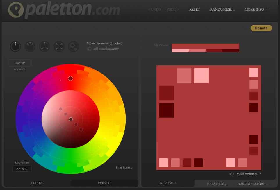
Paletton is quite similar to Adobe Color CC but provides a wide range of color tones that will be highly useful when you want to add more colors in your scheme. Here's a screenshot of Paletton.
3. Generate - Coolors.co
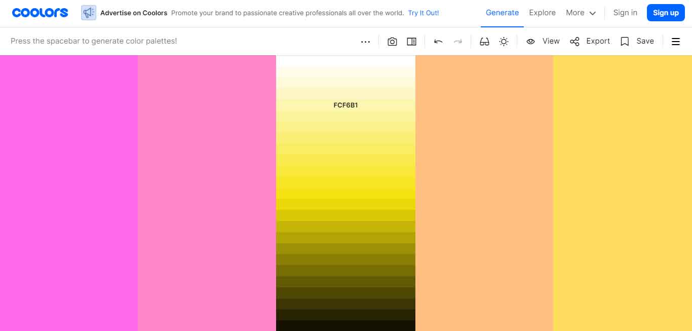
Coolors.co allows you to lock a color and press space to generate a color scheme using that color as the base color. It also allows you to upload an image and generate a color palette from it. Here's a screenshot of Coolers.
7 proven techniques to create effective color schemes for web pages easily
Now, you know what a color scheme is and the best free online tools to generate great color schemes. Now, lets see the best techniques to create effective color schemes for web pages.
1. Right Color Scheme
Color schemes can make or break the identity and popularity of a website. So, get your color scheme right. All the statements above clarifies its importance, so never ignore it. Most of the color schemes generator produces a mix of 3 to 5 colors but you can easily increase the the number by using different tones and tints. The most important thing is to create a harmony of the colors being used.
2. Nature, The Reference
Have you ever thought about it? Every thing we see in the real world seems truly natural. Those are the best color combinations you can use and people will immediately start loving it without even realizing. Take nature as your reference and try them out in you creations.
3. Reflect The Brand
Needless to say, all the professional designers take up the brand's colors as primary and secondary colors. It gives a feeling of familiarity while maintaining consistency in the design. It also helps to keep the color scheme unique.
4. Psychology
Humans are sensitive to colors and can be easily influenced by them. Color psychology suggests that various shades can have a wide range of effects from boosting our moods to causing anxiety. Moreover, factors like age or sex has a significant imact on preference of colors. That’s why, you need to study about your target audience and then select the color scheme.
5. Limit The Number
Keeping the number of colors in the scheme down is very important. The higher the number goes, the harder it becomes to keep balance in the design. It'll be a pain for the users too to go through the pages unless they are children or you are creating an e-commerce site for ladies fabrics. For most of the designs, using a single color with variety of its shades will do the tricks while others might use upto 3 colors excluding the black and white color.
6. Color Proportions
Following a simple rule of 60:30:10 used mostly in interior designing can help you create a proper balance of colors in the scheme. This is the proportion of colors being used where the most dominant primary colors will be used to cover 60% in the scheme, 30% would be the secondary color's proportion while the rest of the proportion will be used up by accent colors.
7. Accessibility
Last but no the least is the accessibility of the site. A designer must ensure that the content is accessible to all user groups including the visually impaired ones. As per the WCAG 2.1 Rules, the texts should be highly readable even on top of the colored backgrounds to enhance its readability to people with low visions. You need to maintain good contrast between the elements. Add texts to UI elements like buttons so that color blind people can also find out the use of those buttons.
Conclusion
Color is one of the major aspect of UI design. Though we think a lot about the right color, there's nothing termed as the wrong one. The only thing that matters is the balance between the colors you choose and the efect it adds to your product. Try out different combinations and pick the best one that pleases your audience and maintains harmony across the pages.

Leave a comment